Hello shutterbugs! This post can be useful not only for product pictures but also for shots of humans and landscapes and really many types of photography! I’m a huge fan of the VSCO app for editing all kinds of images on my phone, and I’m going to share the top settings I play around with to get my pictures to look almost professional.
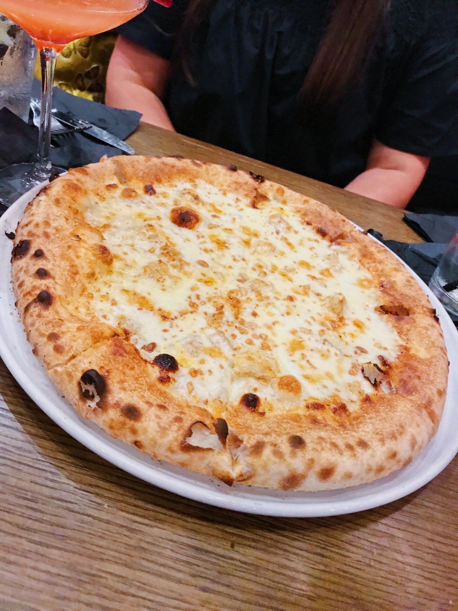
I remember when I first started taking pictures of my products for my Etsy shop, I thought I was killing the game, and now looking back I realize how lost I was. What helped? Things took a turn for the better once I took Hilary Rushford’s “Instagram With Intention” free online workshop, where she introduced us to VSCO (I’m a big advocate for taking any and all free seminars you see offered, there’s always something to learn and you have nothing to lose, especially when they’re free. If it just so happens that you like what you hear, you can subscribe or get a membership to keep getting useful content). Without any further ado, let me share the very basic but completely life-changing tips I learned from Hilary and immediately implemented to my picture-editing game. Let’s keep this interesting with a step by step example: pizza picture please!
- Natural light: this is an obvious one for many (and not a VSCO setting, but I got you guys with a bonus later) but the perfect foundation for good pictures is to take them in natural light – aka, not being hit by direct/yellow light, but placed where it would receive a diffused, indirect “bath” of light. Check out this original shot of a yummy pizza in what looks like natural light. Nothing wrong with it, but it’s definitely not Instagram ready. Yet!

- Exposure: exposure is the vert first setting option, and it stands for the amount of light you want to add or remove from your picture, or how much light you’d want it “exposed” to. I usually move the dial to the right on average to +2-3.5 as shown in the picture, so that it looks like it was professionally lit, and that sometimes helps diminish imperfections as well. Play around with the button and always start off small, because there is such a thing as “overexposed” pictures. This is going to make the pizza look a little pale because there was already light, but the combination of edits is what does the magic.

- Contrast: the contrast feature strengthens the properties of each color, making the light tones lighter, and the dark tones darker. This one is also good to keep at +2-3.5.

- Saturation: saturation is here to make your colors look extra alive! Now, this one I’m super extra careful with, because it usually brings in a strong yellow/orange aura to the picture. So you can play around it and keep it around a +1.5-2.5. The pizza is ready to pop off the screen, but it almost looks like it was under a lamp light to stay warm. Not good yet!

- Temperature: to the left, to the left! The solution to most of your yellow/orange problems is to make the picture colors “cooler” in tone, so literally lowering the temperature will bring on the blue hues. Don’t go too far, just enough to see yellows turning white is perfect. A -1 or -2 usually does the trick.

Now those are the ones I use pretty much for almost every picture edit, but not all pictures are created equal and there’s no one size fits all edit. These are not filters, these are enhancers that work under your guidance to get the tones jussssst right, on an individual basis. But this picture is not perfect yet. The light colors are now a little too light, and it has lost some of the detail. Since I’m more used to playing with the app now, I know exactly what to do next. In this case, I’m going over to the “Highlights” feature. I moved this one up to +10, but I really have no parameters for it since I seldom use it. See how now there are more spots in the cheese? All the colors garnered strength again.

And now, our pizza is ready to get all the glory of Instagram and make your followers salivate. Let’s see the before and after, side by side. Shall we?


Now, the first picture almost makes it look like the pizza was in the oven for a little too long, but the second one literally has me ready to #TBT in real life and go back to that magical moment before having it.
Anywho, I’m no foodie blogger or expert picture taker, but I definitely saw a huge improvement in my pictures over time, and my feed got much, much prettier. The other secret for me has been the white background. That’s a product photography staple, and as much as I tried to fight it at first, it’s simply perfect. I hope these tips help elevate your picture game and if you have any suggestions on other features to use, please drop them in the comments below!
